Aveeno Baby Brand Refresh
Packaging • Portfolio Architecture • Component Color Matching • Icon Development • Brand Guidelines • Social Media • E-Commerce
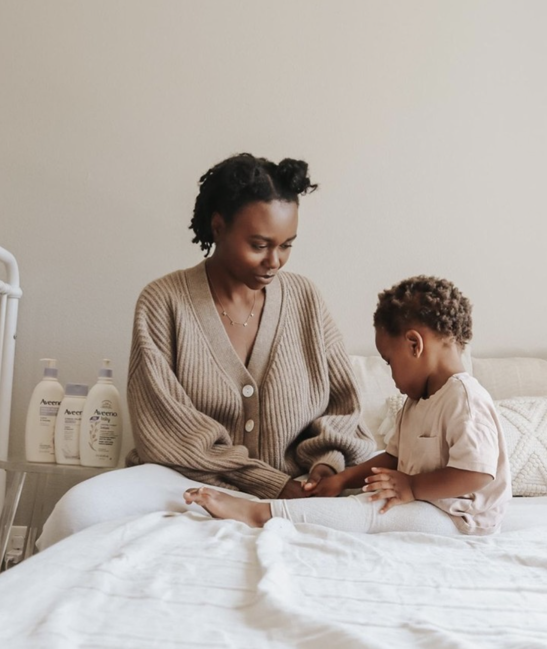
Modernizing to Resonate With Consumers
In 2018, the brand was in need of a modern and more relevant refresh. We needed to clearly communicate the superiority of the brand and reflect it’s leadership in the baby personal care category.
The new brand and packaging improved consumer purchase preference by 60 points, and outperformed the old design in all 12 category attributes by an average of 50 points (via designalytics).
Packaging Design
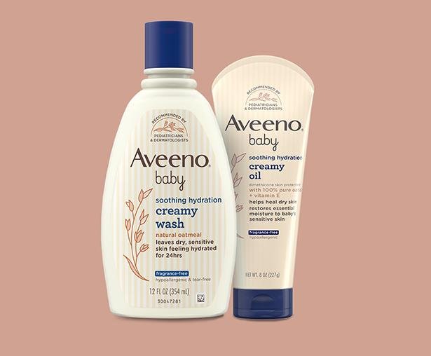
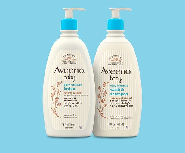
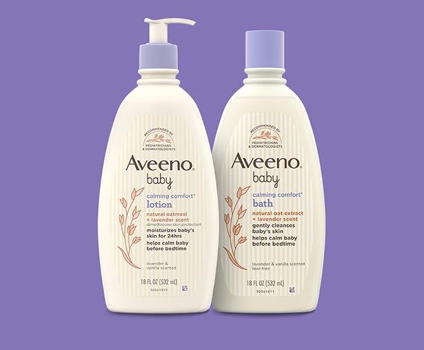
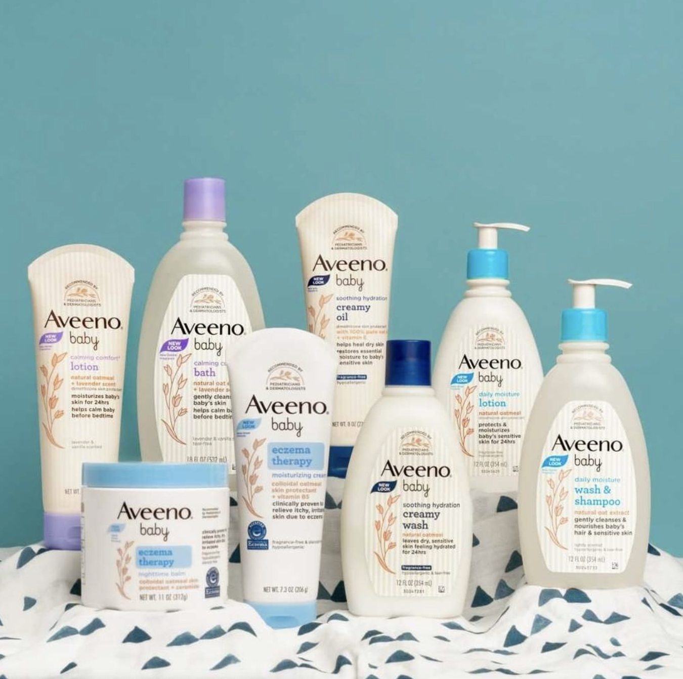
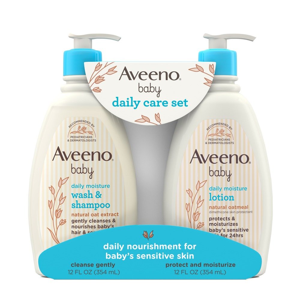
The label architecture achieved clear tiering and ease of consumer shopping at-shelf.
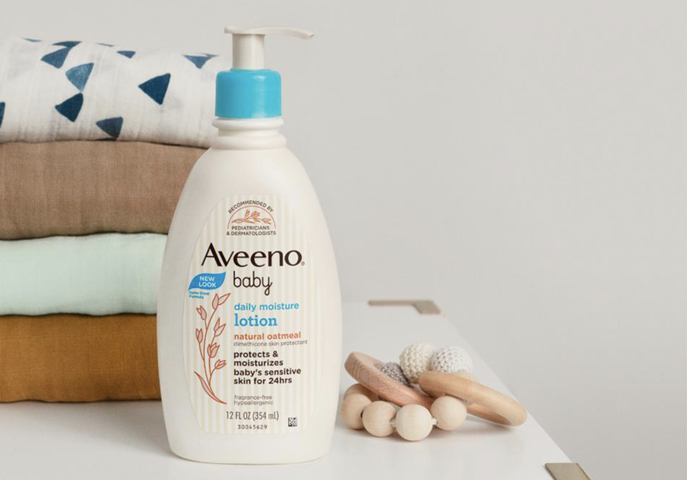
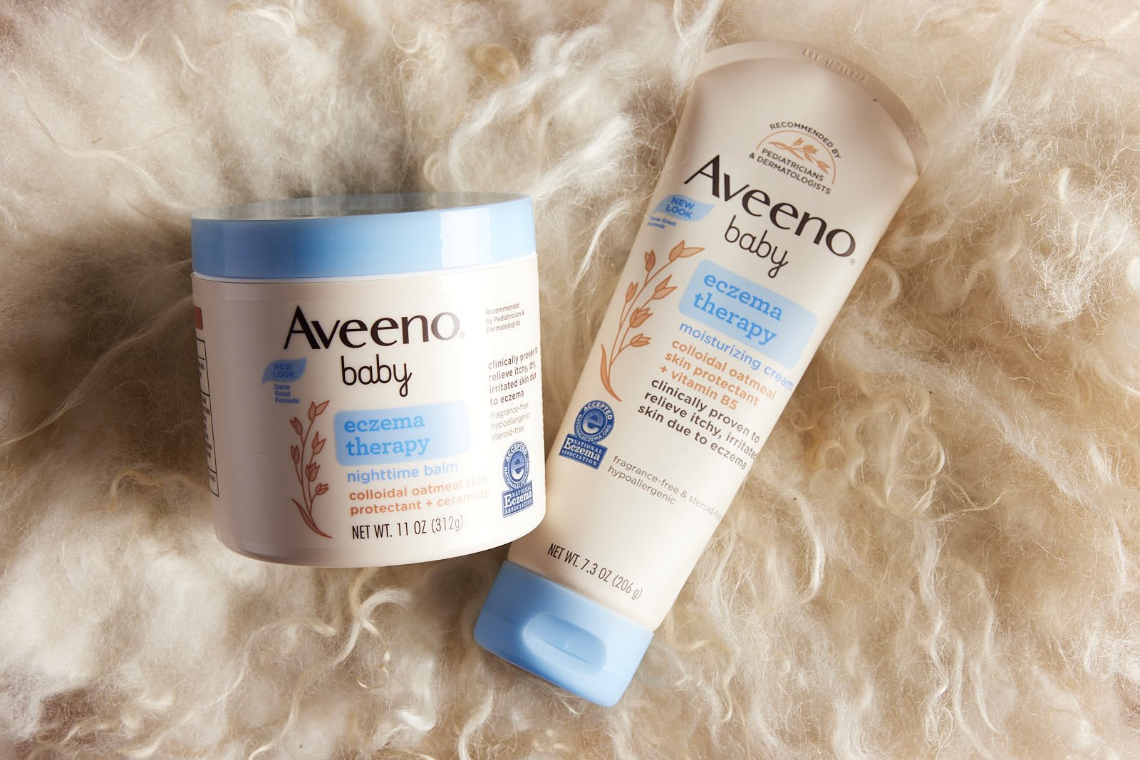
Maintained: Distinctive brand assets like the light oat color, heritage stripes, and bottle shape
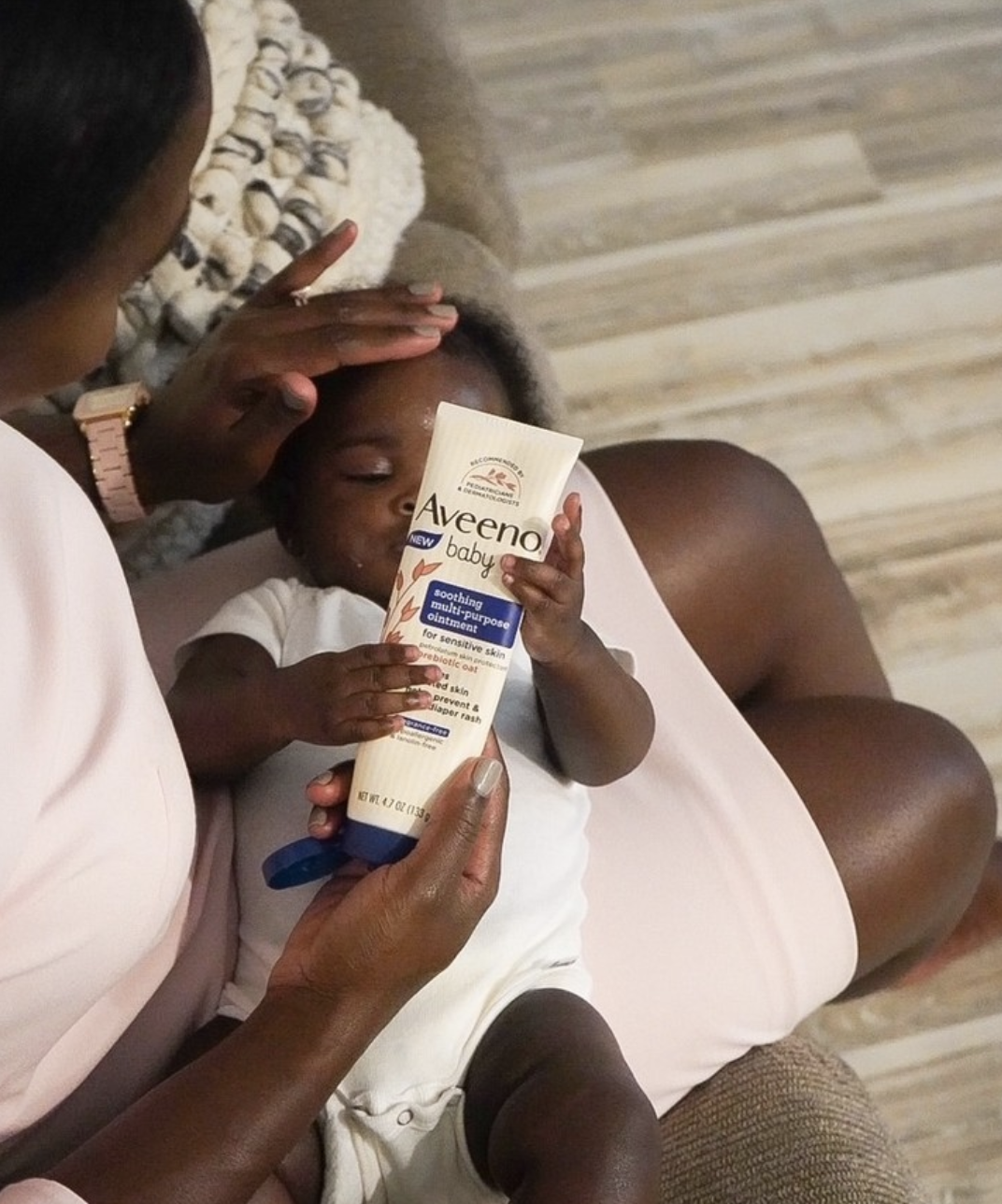
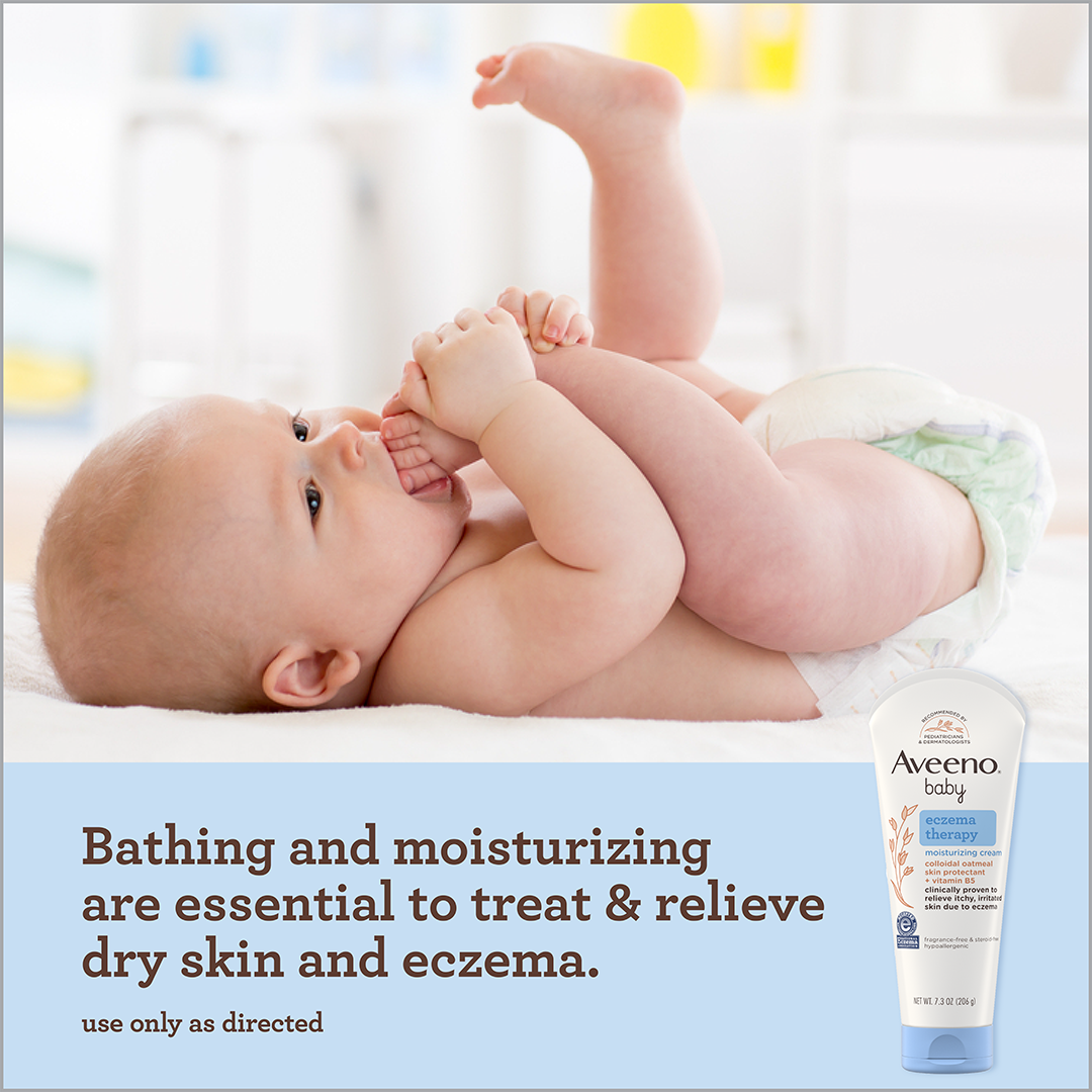
Enhanced: a clearer baby logo, an illustration highlighting oats, a professional endorsement seal, and a consistent Aveeno Brown logo color for visual unity with the masterbrand.
“In the case of Aveeno’s new design, it not only improved in addressing each of the top 12 most important attributes, it dominated the older iteration”
Balancing Science & Nature
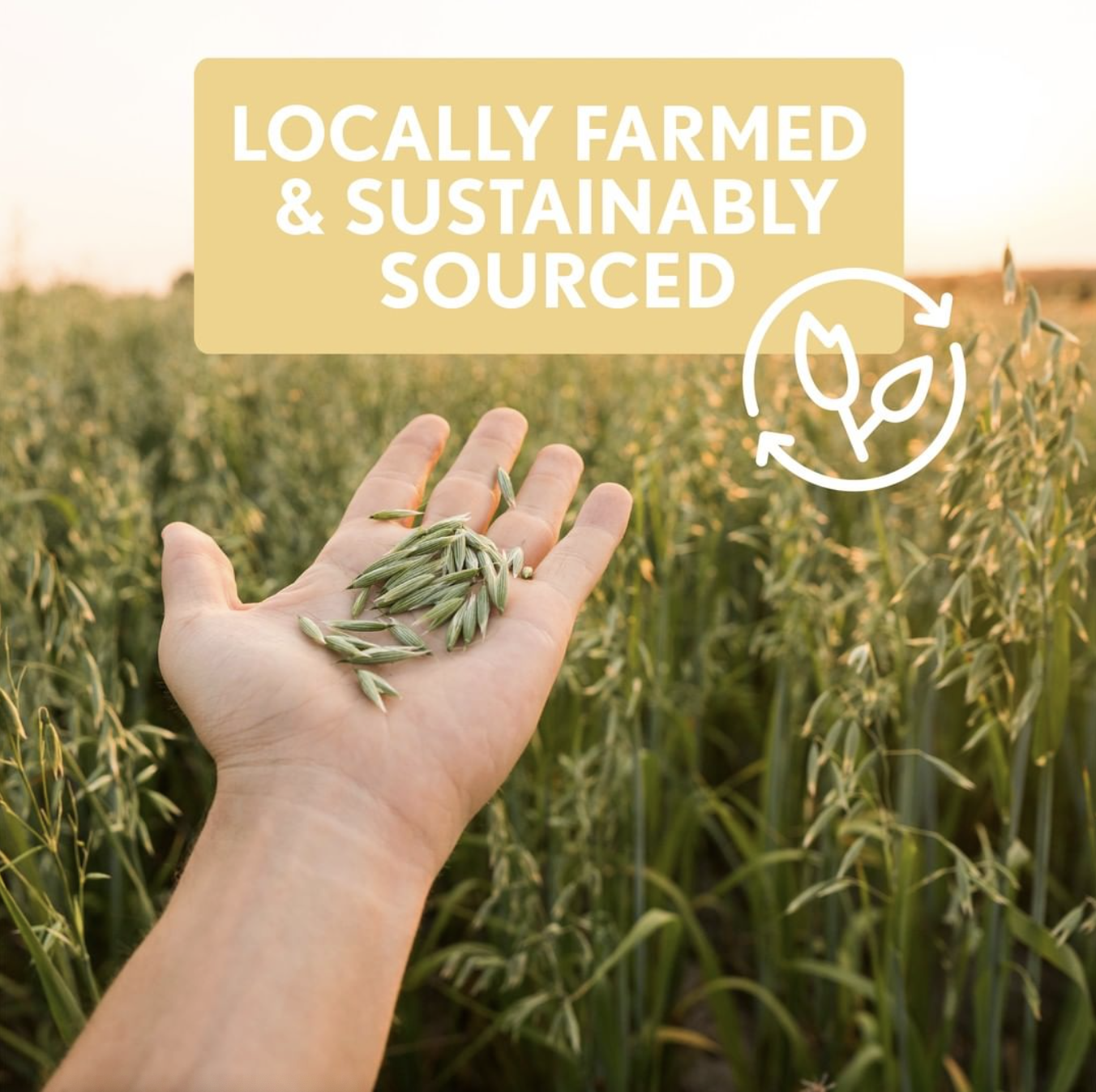
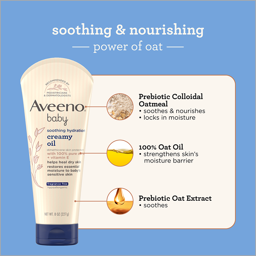
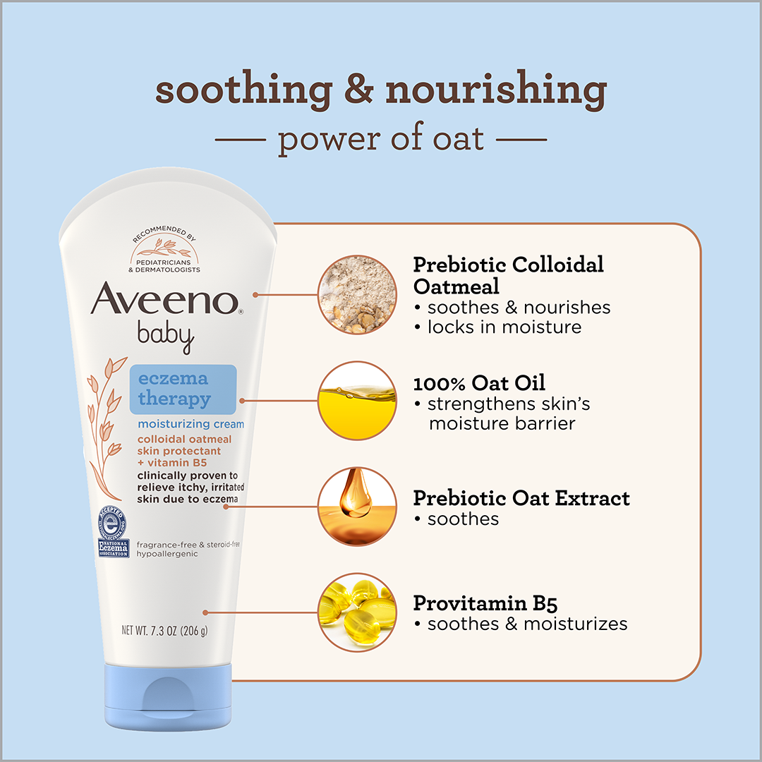
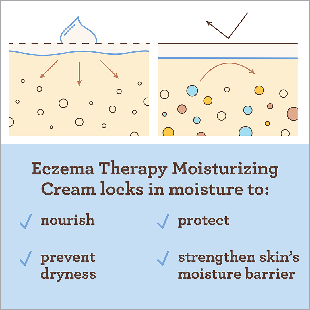
Ingredients are key to Aveeno Baby's proposition. The illustration style and iconography were created to enhance the oat ingredient story and ensure clear communication of product formulation.
Creative Team
Creative Director: Paul Owen
Design Manager: Cassandra Cogbill
Design Lead: Melinda Brechbuehler
Designer: Anna Callaway
Solutions: Pablo Ulpiano
Packaging Production: Jeff Roth, Michael Scelza, Gery Garcia


